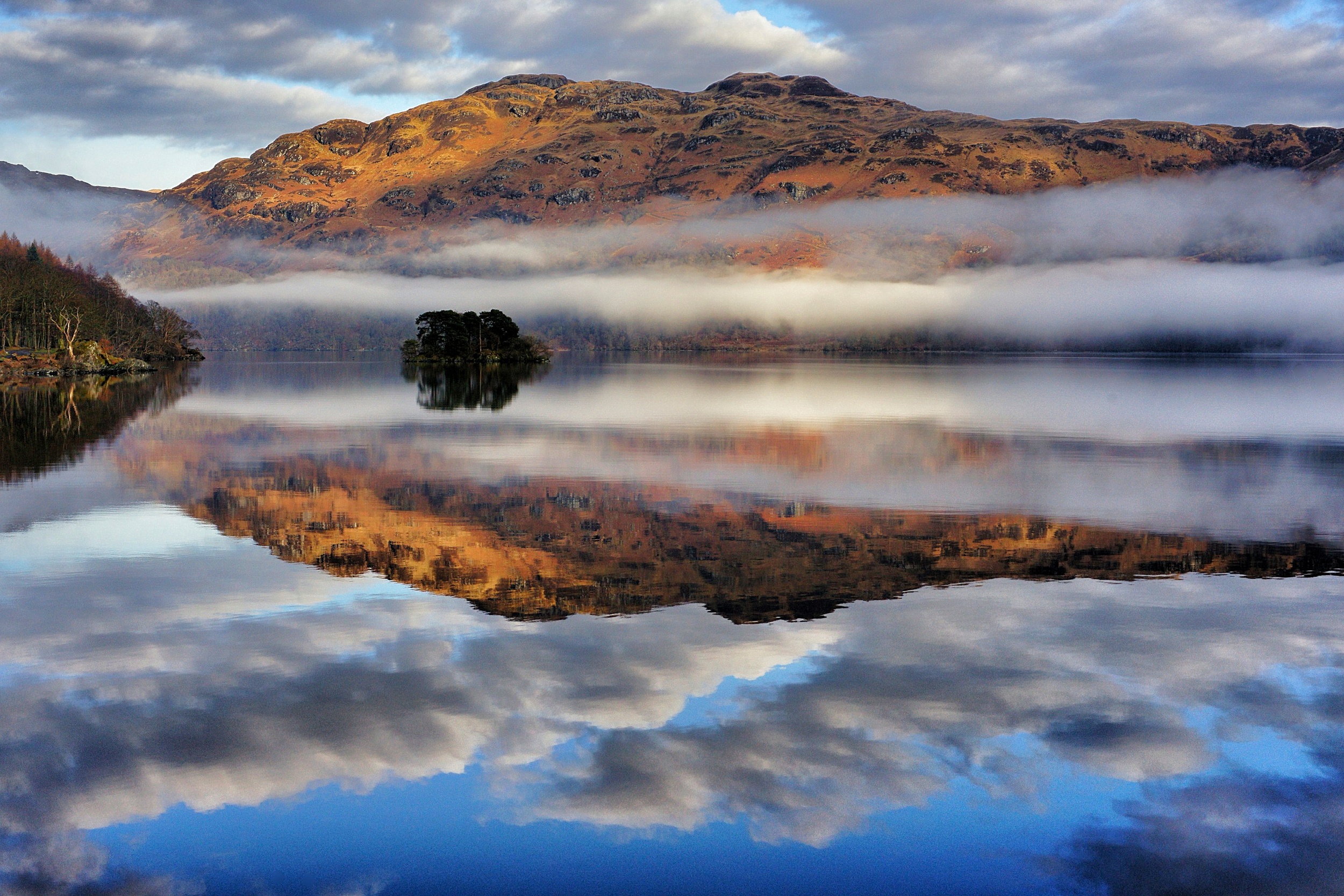
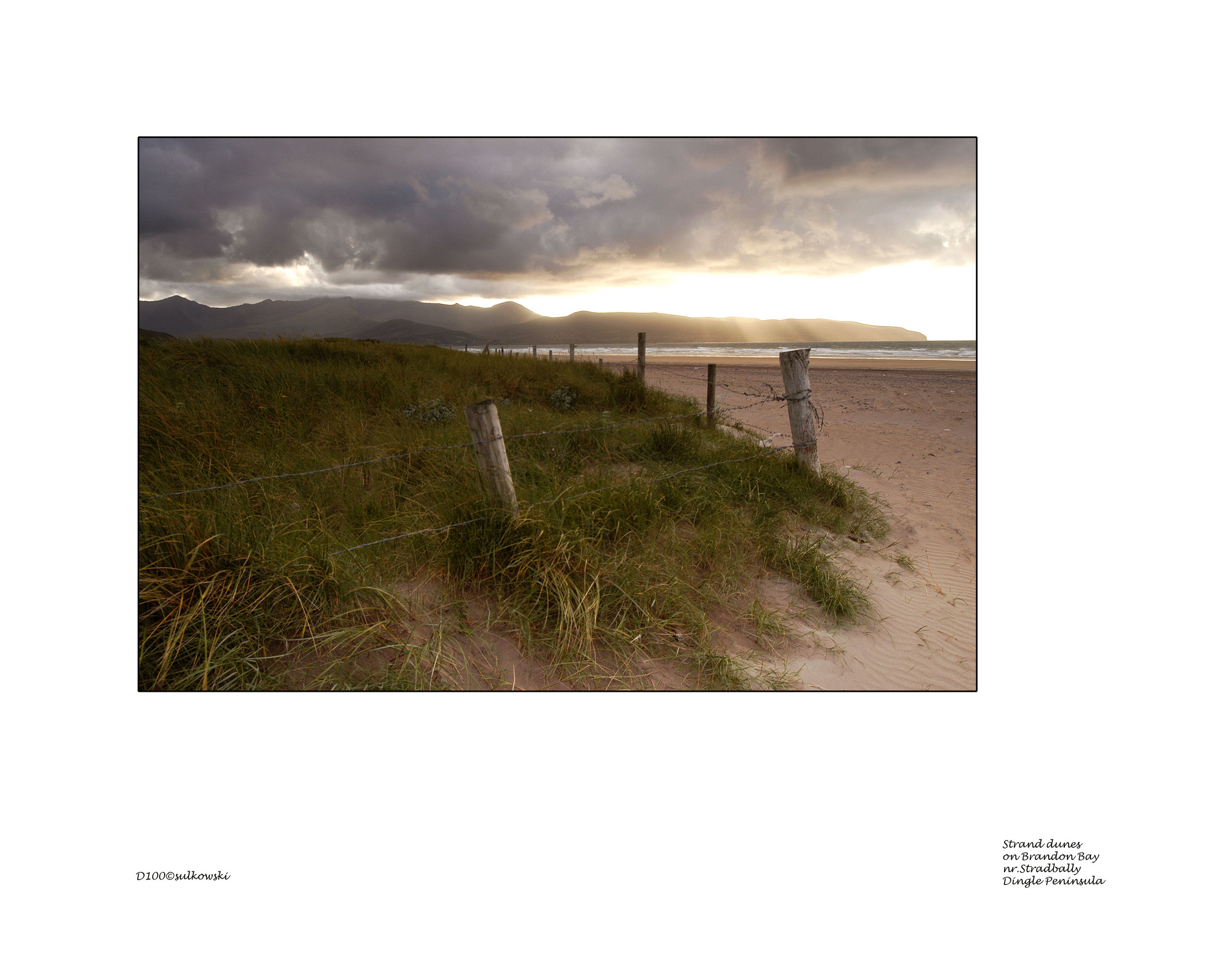
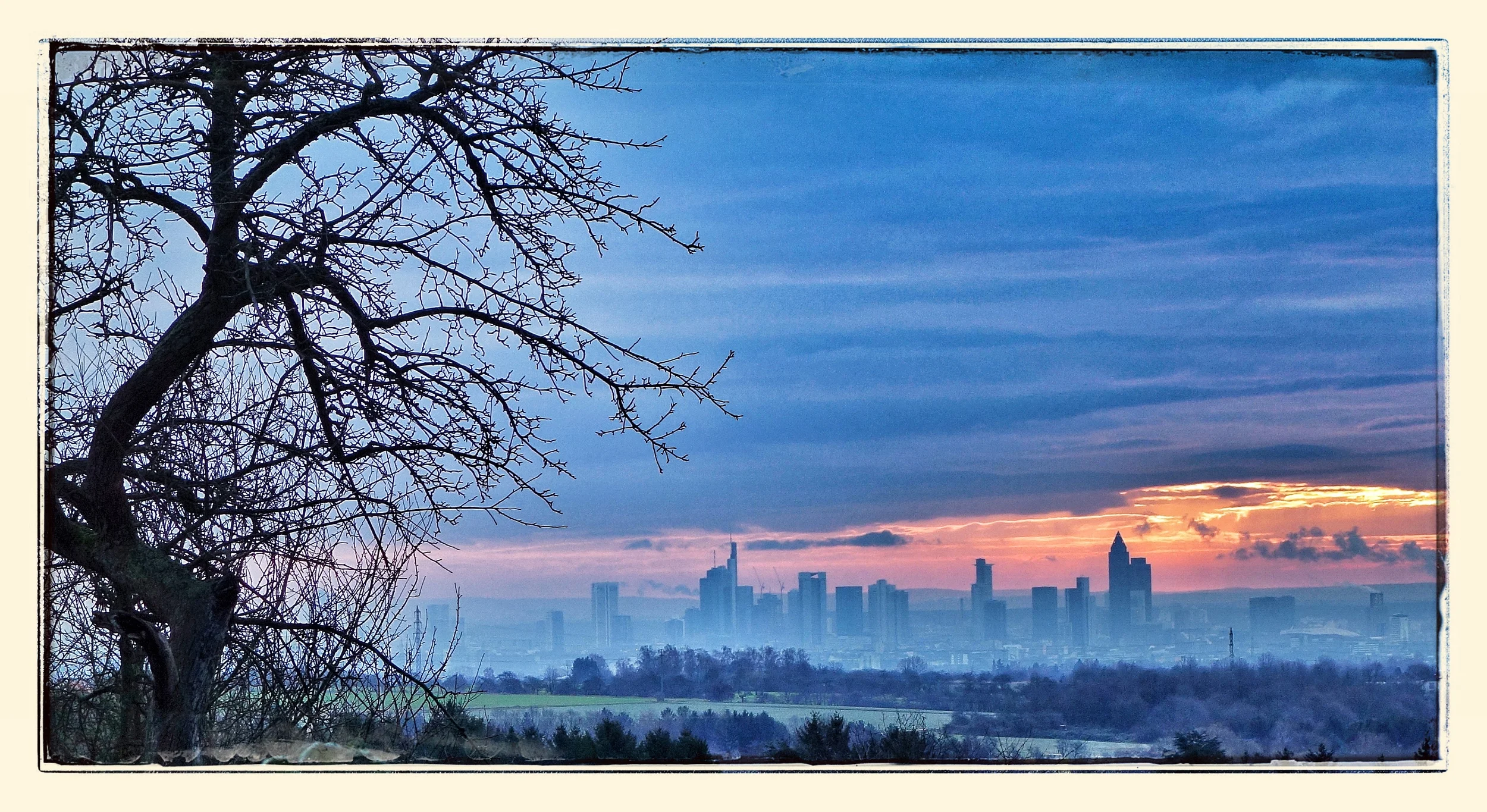
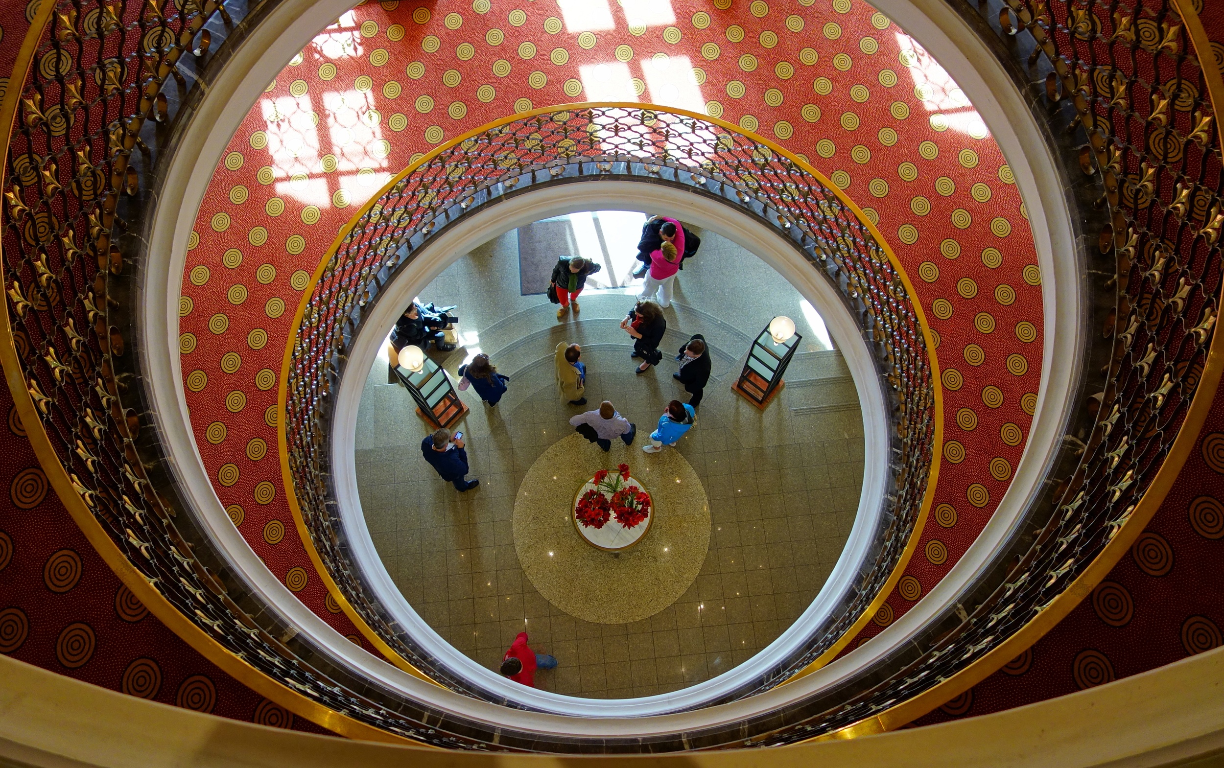
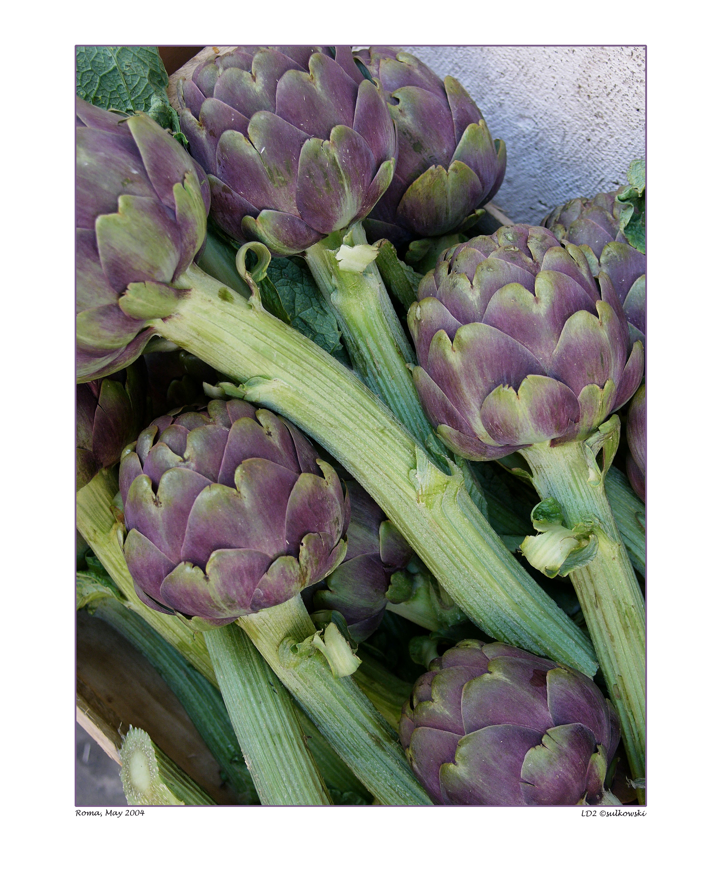
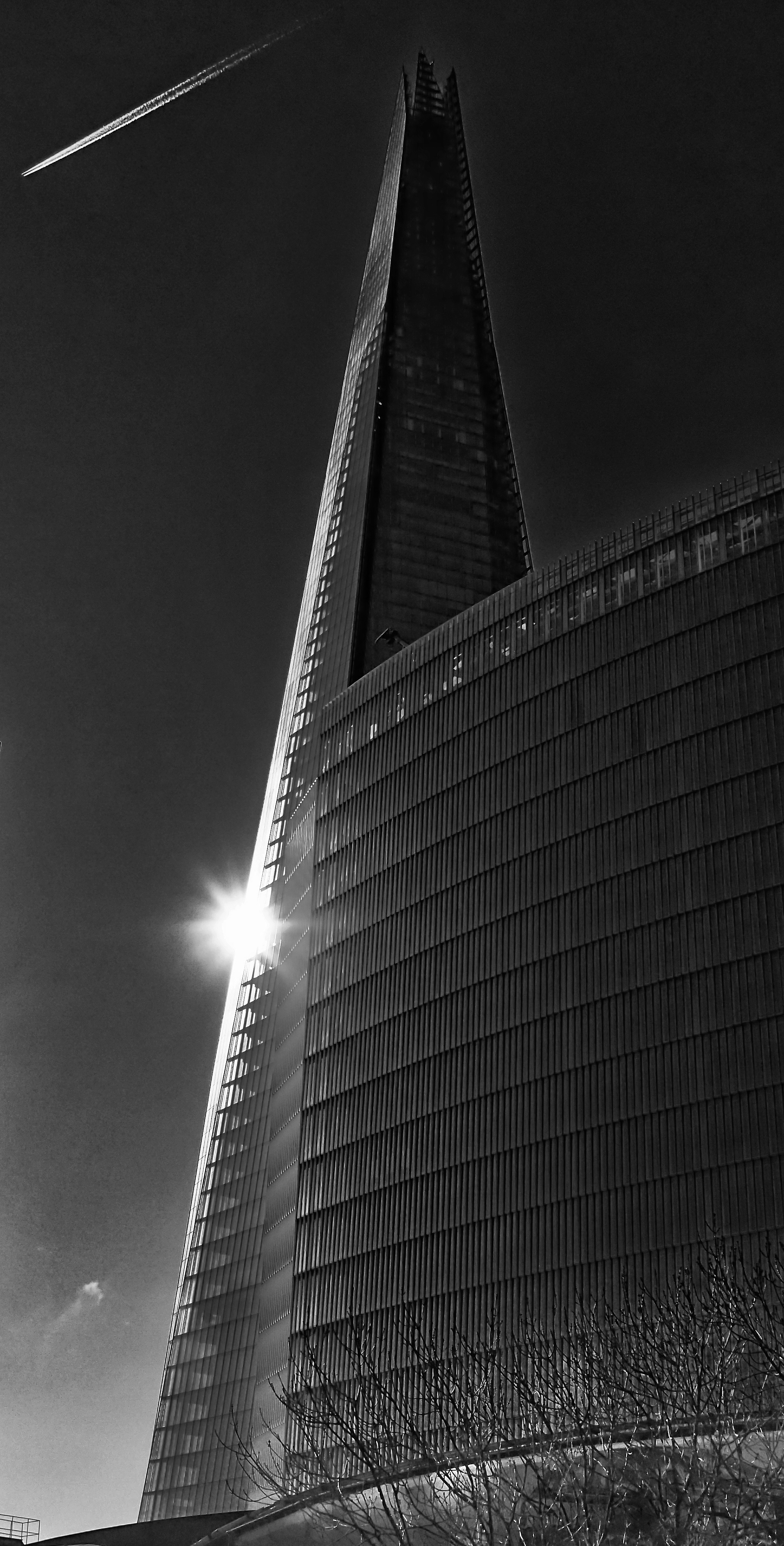
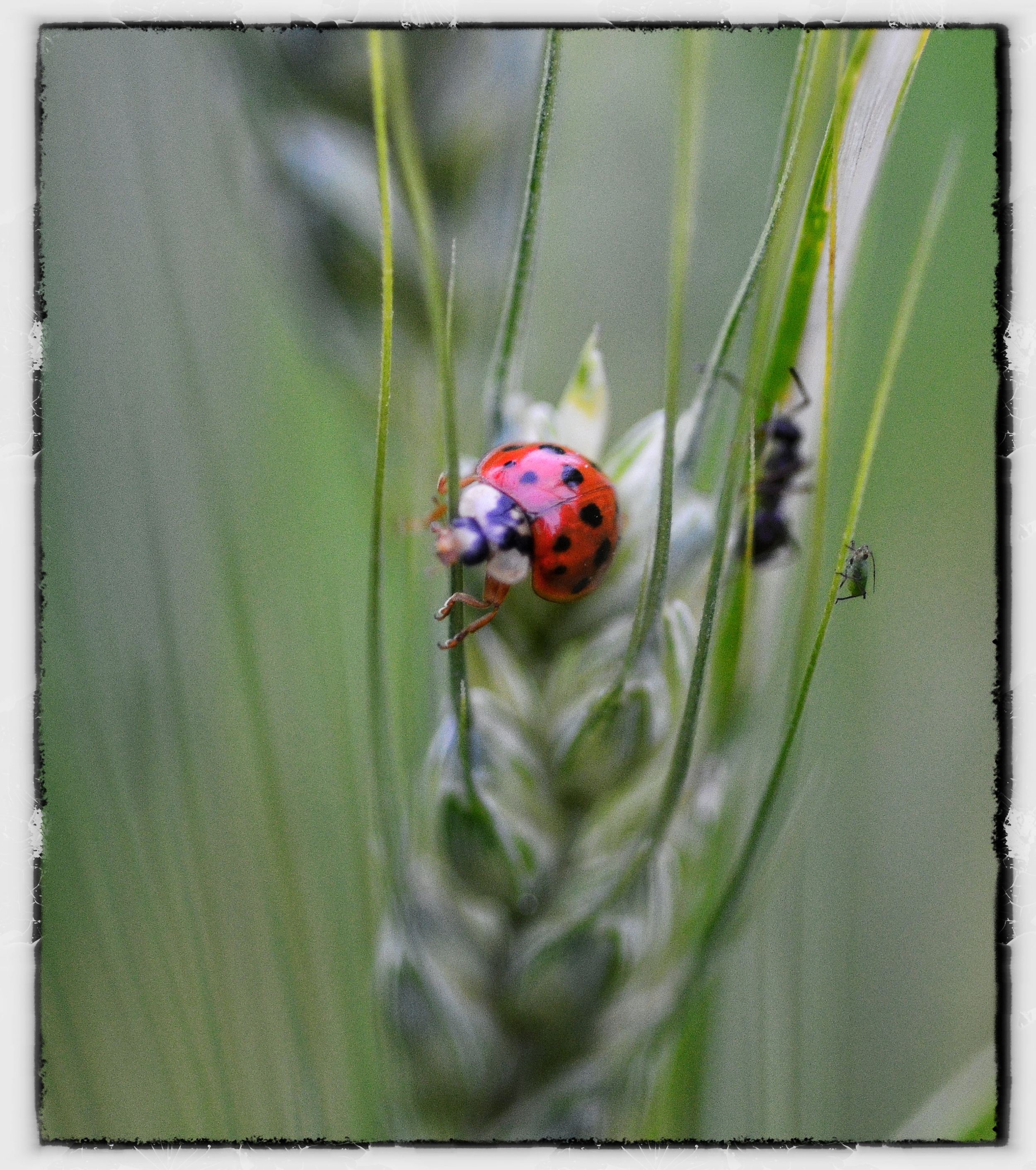
'Picjerz' is just wordplay on what's presented here, the 'Pic' being self-explanatory, the 'jerz' the first four letters of my given name in its original language.
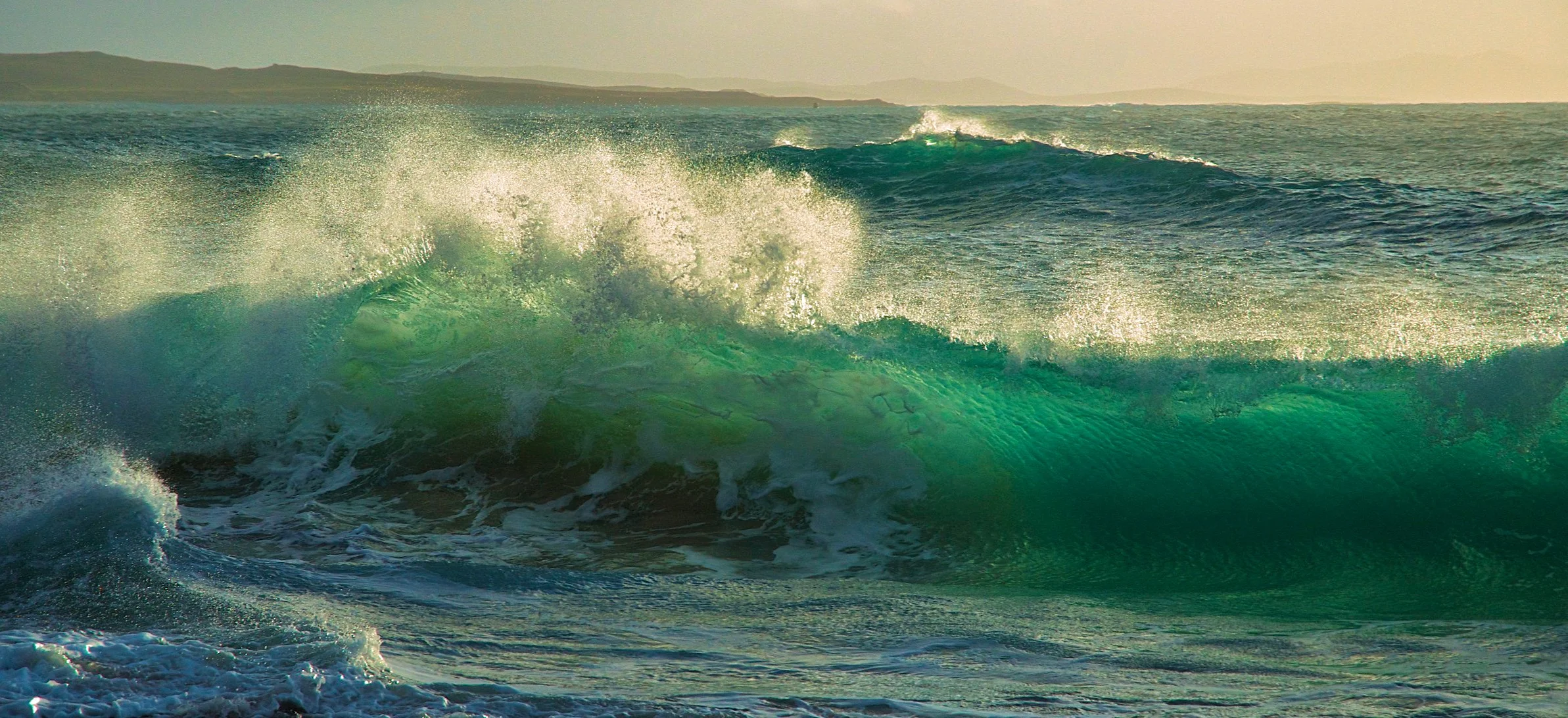
Tràigh Hushinish, Isle of Harris - Olympus EP-3
Like it says, this website is designed more for personal views and use than for selling anything, more for enjoyment than for pixel-peeping. In a nutshell, it displays pictures rather than photographs as, while technique is important to aesthetics, it doesn't always result in perfection: something can be pin-sharp when it doesn't have to be; looks better de- rather than over-saturated; with less contrast rather than more. And vice-versa. And so on.
It's probably enough to say that coming to photography via paint and pastel on canvas, board or paper, impressionism always left more to the imagination and creative enjoyment than straight classicism; waffling was always easier than precision in weightier subjects too, term reports bearing full - and sometimes painful - witness to that fact.
At a workshop in the English Lakes last year, one of the world's best craftsmen, Charlie Waite, showed how to make 'impressionist' art by moving the camera during exposure. Need more be said?
The sometimes-attached equipment-used information, appreciated by some, is largely superfluous and proves just one thing: any camera and any lens can take, let alone make, a bad picture and while you can study technique (it helps of course), camp out in a scenic heaven, learn the tide and sunrise/sunset charts off pat and think you've everything in place for a masterpiece on pressing the shutter, you can't control LIGHT that, together with timing and awareness, is what this is all about, and very often the best of it is right behind and not in front of you, however careful your preconceived set-up.
So, what one needs is luck and patience - and lots of both - to record those few, sometimes fleeting, moments and when and if you do nail them, you'll have been fortunate to have been in the right place at the right time, facing the right way and to have had a camera with you - and it doesn't really matter how old, new, good, cheap, expensive, advanced or indifferent it was, hand-held, three-legged or wedged into a stone wall or bunched-up cardigan for support.
Northton/Taobh Tuath, Isle of Harris - Nikon D7000
But no misunderstandings: I've grown to love all my equipment, no matter its vintage or class, as it always gives me as much almost childish pleasure to handle today as it did on the day that its box was first opened - and as much as Santa's (in other words, Dad's) simple, hand-made wooden toys did some 60-odd years ago. It doesn't make much sense, but I can't bear to dispose of anything, mechanical or electronic, film or digital, no matter its photographic vintage or current usability.
Kodachrome is already history and even Velvia might need some hunting down: a shame, but progress and improvement can't be held back by sentiment and there's no doubt that as image makers we've never had it so good, never had so much quality choice. That said, we need to get really intimate with what we already have to make proper use of its potential: I'd guess that most of us have yet to discover half of what our equipment is capable of but that ninety percent of us are perfectly happy with what little we are aware of, not realising how powerful even the most compact of cameras is today, whether of the fixed or interchangeable lens variety, prime or zoom: nothing like the feet for getting the composition right.
At the Lakes workshop, Mr.Waite and one of the 'work-shoppers', Steve Gray, shared an already-'vintage' Lumix pocket compact: the tutor as back-up - together with an iPhone - Mr.Gray as prime. Having seen Mr.Waite's amazing output from travels around the world with the compact at Cologne's photokina a few years back, it's no surprise that Steve Gray has not only published a book of stunning photographs crafted with the same equipment (website and link to book: www.lightweightlandscapes.com) but also collected a well-deserved Judge's Choice prize at 2013's prestigious 'Take a View' Landscape Photographer of the Year Awards, exhibited at the South Bank's National Theatre in London. All it takes is a good, artistic eye, belief in oneself, a small (but powerful) camera, a couple of filters and a small rucksack.
As some say: it's how you see, plan and execute it, rather than with what - although many will also argue that it's the glass in front of the camera body that plays a more important part in perfecting the image than the number of tiny lenses covering the sensor inside the camera's throat.
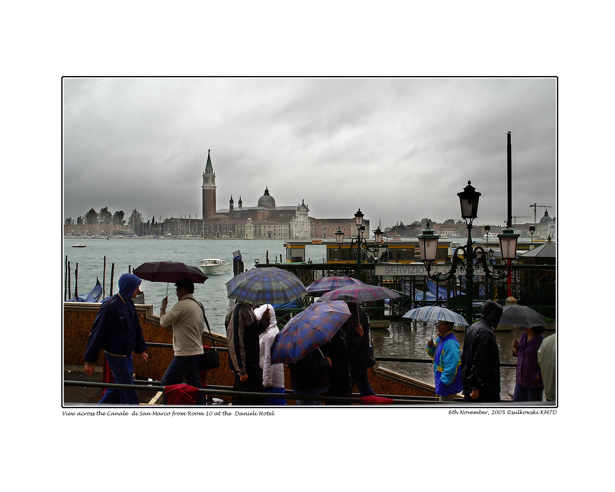
Umbrella Talk: E.39th St/Lexington, NY - Lumix DMC-L1 (7.9MP)
I'm convinced that some of the earlier images I've taken with six, seven and 12MP cropped-sensor cameras have rendered better than those taken with a 24MP full-frame, although the half-dozen or more years of 'pixel progress' in between may actually be making a fairly strong case for a solid tripod - or less wine.
Some of the more 'personal' content on this site won't mean much to the casual visitor: apologies for that. The blog might not always be about pictures either. A recently-made and highly-talented Dutch acquaintance (www.annemariehoogwoud.nl/en/) remarked last year that a World Press Photo contest saw nearly all prize-winning images pay homage to misery: none of that here! Well, perhaps only the misery of not being good enough. While praying for enlightenment every day, there's always a heavier emphasis on the 'light' than on the 'en-enment'.
In this particular form of 'art', criticism is always very welcome. Not sure if this website's 'comments' facility will work but feel free to have a go, about anything, on that or on picjerz@gmail.com any time you have the inclination.
After almost forty years of looking through a viewfinder, what do I actually see? Very clearly that, as a picture maker, I still have a lot to learn. And that I probably need a new pair of spectacles too.
Fire away! This will be a 'live' site, so you can keep shooting!
George Sulkowski - Kronberg, July 2014
A brief slideshow of gallery content follows..........
© All images on the site are original, their metadata and their copyright remaining in my possession (with the copyright of those taken in India 2013 and S.E.Asia shared with my employer, whom I can acknowledge in case of need). Should you wish to use any of them, please just ask on picjerz@gmail.com
This website is constructed on a 'Squarespace' platform, its colour and contrast optimised for iMac or wide-screened monitors that keep it 'clean', but will appear in varying forms on standard PCs, notebooks, laptops, tablets, smartphones and sundry mobile devices.
On an iPad, its graphics may 'float' a little in landscape format and should be touched into place towards the right of the screen for optimum viewing, their captions possibly intruding a little onto the images themselves, while in portrait orientation you'll get the full, enlarged images with the relevant but unobtrusive captions below. In landscape format, on larger screens, the menu will usually run top to bottom on the left side of the screen.
In portrait orientation, the menu press is top right of the screen and you'll need to scroll back up to it to move on to the next gallery or for general navigation.
On smaller tablets and 'phones the menu press will be top right whatever the orientation.
The 'Blog', for which I did a dry run from the end of August to the end of October, initially more in the form of a diary, accommodates three 'issues' per page and shows the latest one first, the 'next'/'previous' press at bottom left to open earlier pages. The 'weight' of total content might require a little patience when loading the slideshows as these could take a minute or two: they load from the back, so the images for the most recent blog load last.
Comments and criticism welcome.


